Pippy's sell leakproof period underwear and period swimwear, made in the UK. I built Sarah's original online store on WooCommerce in 2022, and that part was straightforward. The catalogue is organised by absorbency rather than by style — liner, light, moderate, heavy, super heavy — so a customer chooses by what they actually need instead of working it out from product names.
The interesting problem came later, and it wasn't a technical one.
The Challenge
For the first products, Sarah commissioned photography locally, with a model. It disappointed her on every axis that matters for a brand like this. The image quality wasn't what she had hoped for. The art direction was limited to what could be arranged on the day. And the model was whoever was available.
That is a hard position for a start-up. For a product worn against the skin, photography is most of what a customer judges before they trust the brand enough to buy — and it is the cost a young business can least afford to pay twice. Booking another shoot means committing the budget again with no guarantee the second attempt lands closer. Carrying on with imagery the client doesn't believe in undersells a product that genuinely stands up.
The deeper problem was that there was nothing to shoot to. No one had written down what a Pippy's photograph should look like, so each shoot was a fresh negotiation and consistency across a growing range was never going to happen by accident.
The Solution
When the next range launched in 2025 — underwear and swimwear — I rebranded, and the branding is what solved the photography.
I started with the brand itself rather than the pictures: who it talks to, what it sounds like, and what it should feel like to deal with. Pippy's voice came out of that as a straight-talking older sister — reassuring, a little dry, never euphemistic, never dramatic. That became the one-line message the site still leads with: No mess. No stress. No less.
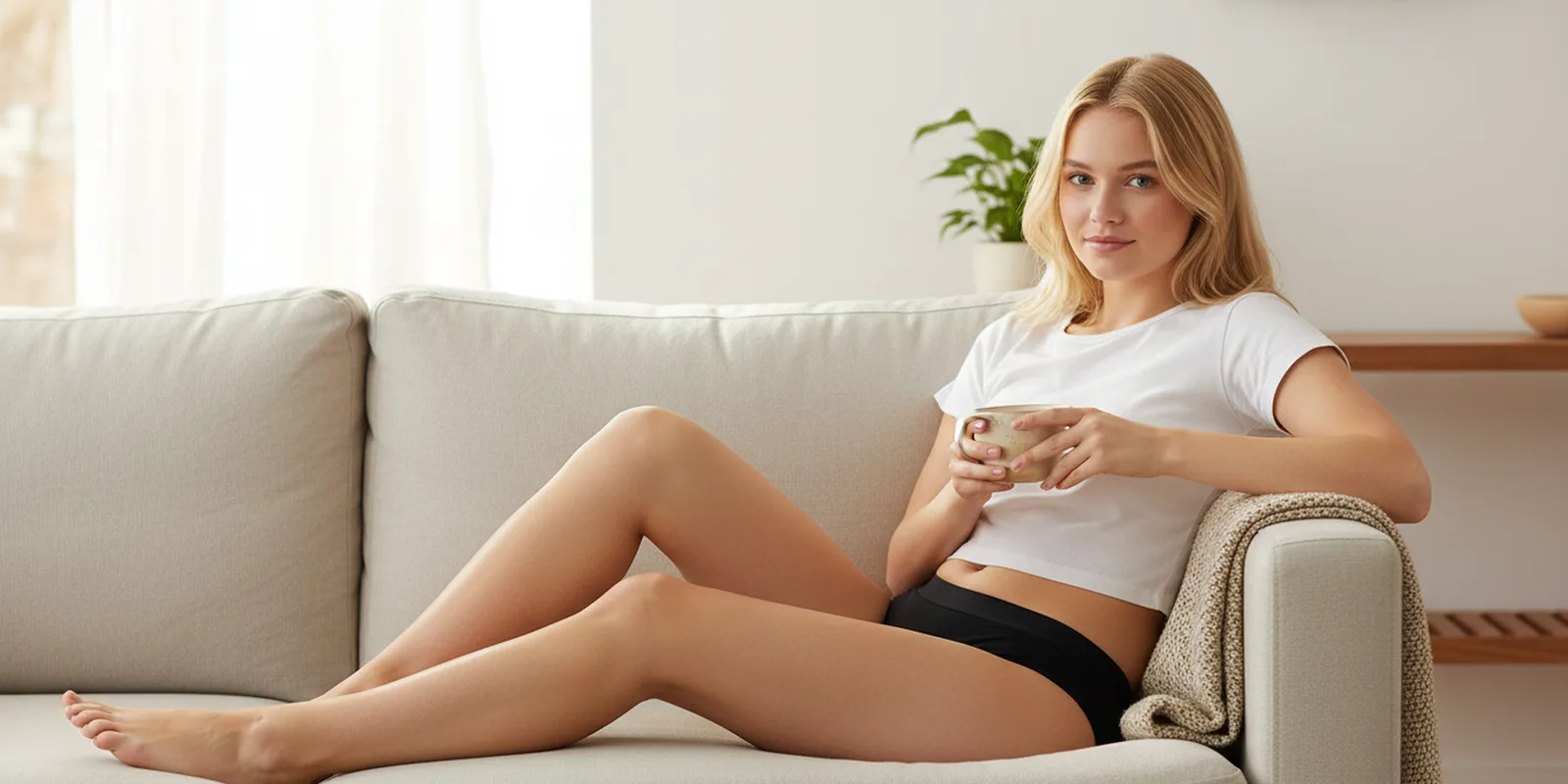
From there I wrote the visual direction down, as a document, before anything was produced. It has a name — functional intimacy — and it is specific: natural morning light, warm-neutral tones, pale breathable backdrops, tactile fabric, unretouched skin, medium portraits, no studio gloss. Deep Merlot to anchor, Electric Rose only where something needs to punctuate. Then I built moodboards to that direction and took Sarah through three rounds of them, so she could see and reject directions while rejecting them was still free.
With the direction settled, the imagery was produced to it rather than discovered on the day. That started with a single defined brand model, fixed by a reference sheet so she stayed recognisably the same person from shot to shot. We moved away from her fairly quickly, though, because we wanted a more diverse cast — and that turned out to be the more useful freedom. The original shoot could only show the woman who was available that afternoon. Producing to a written direction meant the range could show a range of women, which for a product like this matters more than any single face recurring. What holds the imagery together is everything around whoever is in frame: the same morning light, the same pale backdrops and tactile fabric, the same palette, the same unfussy framing. Swap the model and the brand still reads as itself — which is the test a written art direction has to pass and a shoot day rarely gets the chance to.
The same brand work then did a second job. I wrote the content direction from the documented tone of voice — including what not to do, like never saying "people who menstruate" and never dressing the brand up as a cause — and the product copy across the range was generated from it. That is why a heavy-flow brief and the homepage sound like the same person talking.
The Results
The range is presented consistently across the whole store, and it reads as the work of a brand with a marketing department behind it. No second shoot was commissioned. The copy carries one voice from the homepage down to an individual product, because it came from the same document the visual direction did.
The wider point is about what a small brand can now reach. A start-up competing against established names is usually given away by its photography, and fixing that has meant money it doesn't have. Deciding the direction properly and then producing to it gets a young brand to a standard that used to require a budget — and, unlike a shoot, the direction is still there the next time there is a new range.
Sarah is open about how the imagery is made, which I think is the right call. The product is real, the claims about it are real, and the method is just how the pictures got taken.